Binomial relative likelihood and its interval
library(dplyr); library(ggplot2)The likelihood function is fascinating. It’s a statistic or “data reduction device” used to summarize information. Practically it’s very useful for constructing statistical intervals, comparing models, and measuring the quantity of information extracted by a particular model.
Like statistics in general, the likeihood function is also really great at reducing data. That’s ridiculously handy in a “Big Data” world. Somewhat suprisingly, the function is also really useful for squeezing the very most information out of data, making the most of small data.
Consider the joint (data + distribution) probability density (or mass) function \(f(x|\theta)\). This relatively familiar function is equal to \(L(\theta|x)\). Equal!
The difference is whether one considers the parameters fixed (“given”), or the data fixed (“given”).
The idea of treating the data we observed as “fixed” leads to the maximum likelihood estimation procedure. The MLE procedure is incredibly flexible, it’s kind of like the swiss-army knife of estimation. In particular it’s very useful for binned, truncated or censored data.
Here I’ll show how the method can be used to construct intervals.
Example
Suppose we’re running a business and we’ve just started a sales process. We have have no idea what our hit rate will be, but we want to make some financial projections through the end of the year.
We assume that our skill doesn’t appreciable change throughout the year nor do the quality of the leads. :-p
We start emailing leads and recording how many times we get to a “yes!” Our business manager is impatient and after emailing 10 leads demands to know how many we’ll close throughout the year. Of course we’re going to give them a range because we’re uncertain and they’re running a their own scenarios. This is a new process and the business doesn’t yet depend on it, so we’re pretty tolerant of error. In fact, we’re okay with a 75% chance that the interval will contain the year-end value.
We’ve closed three deals after emailing the ten leads.
sales <- 3
leads <- 10
We create a function that, given our data, can tell us how likely a particular value of p (the probability of closing a deal) is.
binomial_likelihood <- function(p) {
  dbinom(sales, leads, p)
}
Now let’s try a bunch of values between 0% and 100%.
d <- tibble(p = seq(0, 1, 0.001)) %>%
  mutate(likelihood = binomial_likelihood(p)) %>%
  mutate(maximum_likelihood = max(likelihood),
         relative_likelihood = likelihood / maximum_likelihood)

d %>%
  ggplot(aes(x = p, y = relative_likelihood)) +
  geom_line() +
  geom_hline(yintercept = 0.25) +
  ylab("Relative likelihood") +
  xlab("Probability of converting the lead") +
  theme_bw(18) + theme(axis.text = element_text(colour = "black"))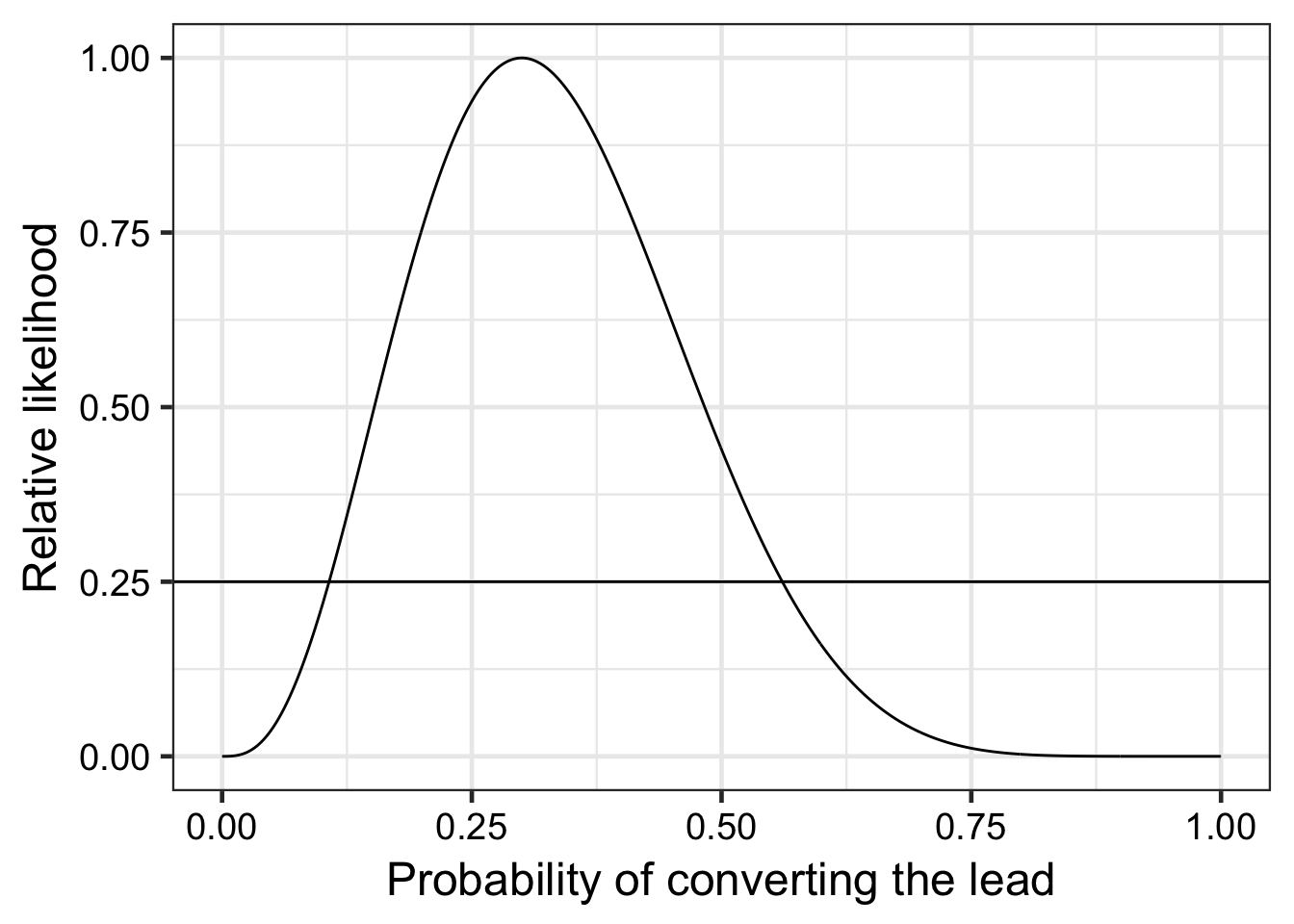
Using the relative likelihood method,
d %>%
  filter(relative_likelihood < 0.25) %>%
  arrange(relative_likelihood) %>%
  tail(2) %>%
  pull(p) %>%
  scales::percent()
## [1] "10.7%" "56.1%"We tell the business manager, at least 1 in 10 and probably not more than 1 in 2. Look how much uncertainty we eliminated with just ten leads!