Are U.S. natural gas pipeline incidents more common?
Dec 1st, 2016
It seems like every other week there’s another natural gas pipeline explosion on the news. I wanted to find out if they’re more common as of late.
Data source
The Pipeline and Hazardous Materials Safety Administration maintains a set of long-run incident logs: http://phmsa.dot.gov/pipeline/library/data-stats/flagged-data-files.
Aside from being a proprietary format, the data files are pretty clean and well organized.
# my_file <- tempfile()
# download.file("http://phmsa.dot.gov/staticfiles/PHMSA/DownloadableFiles/Pipeline/PHMSA_Pipeline_Safety_Flagged_Incidents.zip", destfile = my_file, mode = "wb")
# unzip(my_file)

library(readxl)
library(dplyr)
readxl::read_excel("gtgg1986to2001.xlsx", sheet = "gtgg1986to2001Fields", skip = 1)
## # A tibble: 85 × 4
## `Field Name` `Data Type`
## <chr> <chr>
## 1 DATAFILE_AS_OF Date
## 2 SIGNIFICANT Varchar2
## 3 SERIOUS VARCHAR2
## 4 RPTID Number
## 5 DOR Varchar2
## 6 OPID Number
## 7 NAME Varchar2
## 8 ACCITY Varchar2
## 9 ACCOUNTY Varchar2
## 10 ACSTATE Varchar2
## # ... with 75 more rows, and 2 more variables: `Field Name
## # Description` <chr>, `Form Location` <chr>library(ggplot2)
readxl::read_excel("gtgg1986to2001.xlsx", sheet = "gtgg1986to2001") %>%
select(incident_on = IDATE, fatalities = FAT, injuries = INJ) %>%
bind_rows(
readxl::read_excel("gtgg2002to2009.xlsx", sheet = "gtgg2002to2009") %>%
select(incident_on = IDATE, fatalities = FATAL, injuries = INJURE)
) %>%
bind_rows(
readxl::read_excel("gtgg2010toPresent.xlsx", sheet = "gtgg2010toPresent") %>%
select(incident_on = LOCAL_DATETIME, fatalities = FATAL, injuries = INJURE)
) %>%
mutate(incident_on = as.POSIXct(incident_on, origin = "1970-01-01")) %>%
arrange(incident_on) %>%
mutate(id = 1:n(),
fatalities = ifelse(is.na(fatalities), 0, fatalities),
injuries = ifelse(is.na(injuries), 0, injuries)) %>%
mutate(cumulative_incidents = cumsum(id),
cumulative_fatalities = cumsum(fatalities),
cumulative_injuries = cumsum(injuries)) %>%
select(-fatalities, -injuries) %>%
reshape2::melt(c("id", "incident_on")) %>%
ggplot(aes(x = incident_on, y = value)) +
geom_step() +
facet_wrap(~ variable, scales = "free_y", ncol = 2) +
theme(axis.text.x = element_text(angle = 45, hjust = 1, vjust = 1, size = 8)) +
xlab("")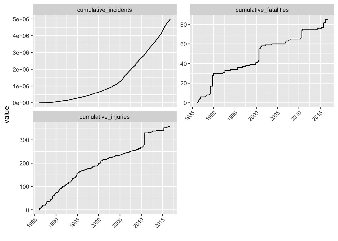
In statistical lingo, these series are point processes. There two basic types: homogenous and non-homogenous. Homogenous point processes (“HPPs”) are neither speeding up or slowing down in rate. They’re a constant rate. Non-homogenous point processes (“NHPPs”) are either speeding up or slowing down or doing all of the above.
While precise determinations are possible, a simple trick makes determining the type of point process simple. Sort by timestamp and give an incrementing id, 1 … 5,000,000. This is the cumulative count, then plot this over the time of incidents. If the plot looks like an exponential curve, the rate is increasing. If it looks like a logrithmic curve (sort of downward facing) the rate is slowing down.
Starting with the upper left. Cumulative incidents. Incidents actually are increasing. I thought it might be that they were better reported on. Upper right. Fatalities. Jumps are visible. I tracked down the one on September 9th, 2010. This was the explosion of a 32-inch Pacific Gas and Electric Company natural gas pipeline. That explosion caused over 50 injuries and is also visible in the cumulative injuries chart. That jump aside it looks like the rate of injuries caused by pipeline explosions is declining.