Time-to-event data are extremely common in industry. Commonly one has timestamps from a log file and wants to gain some understanding of a conversion rate. We can borrow from the manufacturing industry and deploy Weibull analysis.
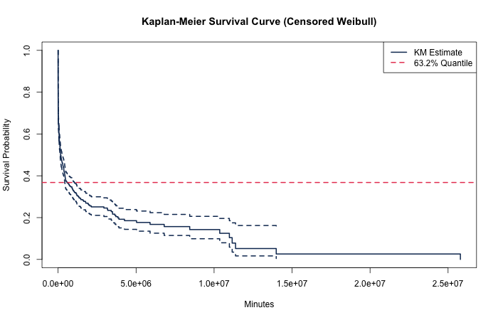
Weibull analysis can get us a quick measurement of a special statistic called the "characteristic life" — the 0.632 quantile (63.2 percentile) of a conversion rate under the Weibull model. Estimation of characteristic life over many different conversion rates yields a way to compare a basket of conversion rate scales.
Why Is the Characteristic Life 63.2%?
The Weibull CDF gives the probability that an event has occurred by time \(t\):
\[ F(t) = 1 - e^{-(t/\eta)^\beta} \]
When we evaluate at \(t = \eta\) (the characteristic life itself), the shape parameter \(\beta\) cancels completely — because \((\eta/\eta)^\beta = 1^\beta = 1\) for every \(\beta\):
\[ F(\eta) = 1 - e^{-1} \approx 0.6321 \]
That's the answer: 63.2% comes directly from Euler's number \(e\). No matter the shape of the hazard — infant mortality (\(\beta < 1\)), constant hazard (\(\beta = 1\)), or wear-out (\(\beta > 1\)) — exactly 63.2% of the population will have experienced the event by the characteristic life \(\eta\). This shape-independence is precisely what makes \(\eta\) so useful for comparing systems with fundamentally different failure modes.
📖 Read the full derivation with examples from physics, EE, and probability theory →
The Right-Censoring Challenge
These data are right-censored (Type 1 censored). We collect data from the start of some process and often we observe conversion, but sometimes we do not. The remaining unconverted units could all convert the moment after we pull the data, or they might never convert.
Setting Up the Simulation
suppressPackageStartupMessages({
  library(dplyr)
  library(purrr)
  library(survival)
  library(ggplot2)
  library(glue)
  library(ggthemes)
})
set.seed(0)

N <- 1e3        # observations to generate
shape <- 0.3    # quick stimulus, fast decay
quantile_632 <- 5e5  # ~350 days to 63.2% converted

(x <- rweibull(N, shape = shape, scale = quantile_632)) %>%
  tibble(x = .) %>%
  ggplot(aes(x = x)) +
  geom_histogram(colour = "black") +
  ggtitle(glue("Histogram of X ~ Weibull(k={shape}, λ={quantile_632})")) +
  xlab("Minutes")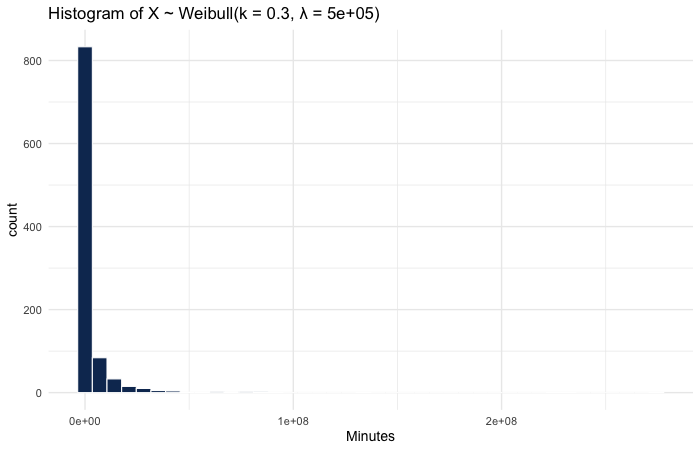
A Censored Weibull Generator
There's no built-in R function for generating censored Weibull data. The idea: draw from two generating processes. If the censoring process returns a time prior to that of the death process, the observation is censored; otherwise we've observed death (conversion).
rweibull_cens <- function(n, shape, scale) {
  a_random_death_time   <- rweibull(n, shape = shape, scale = scale)
  a_random_censor_time  <- rweibull(n, shape = shape, scale = scale)
  observed_time <- pmin(a_random_censor_time, a_random_death_time)
  censor <- observed_time == a_random_death_time
  tibble(time = observed_time, censor = censor)
}
Validating the Generator
Always check a random number generator by feeding it known parameters and recovering them:
rweibull_cens(1e6, 0.3, 5e5) %>%
  flexsurv::flexsurvreg(Surv(time, censor) ~ 1, data = ., dist = "weibull")
## Estimates:
##       est       L95%      U95%      se
## shape 3.00e-01  2.99e-01  3.01e-01  3.31e-04
## scale 4.99e+05  4.94e+05  5.03e+05  2.40e+03
##
## N = 1000000, Events: 500928, Censored: 499072
Confidence Interval Coverage
For validation, I generate 100 samples and check that confidence intervals mostly contain the known parameters, coloring intervals that miss:
seq_len(100) %>%
  map(~ rweibull_cens(N, shape = shape, scale = quantile_632)) %>%
  map(~ { .$sample <- uuid::UUIDgenerate(); . }) %>%
  map(function(x) {
    survival::survreg(Surv(time, censor) ~ 1, data = x,
      dist = "weibull",
      control = survreg.control(maxiter = 100)) %>%
    broom::tidy() %>%
    mutate(sample = unique(x$sample))
  }) %>%
  bind_rows() %>%
  filter(term == "(Intercept)") %>%
  mutate(lower = exp(conf.low), upper = exp(conf.high)) %>%
  mutate(actual = quantile_632) %>%
  mutate(miss = ifelse(
    actual < lower | upper < actual,
    "Failed to include real parameter",
    "Included parameter")) %>%
  ggplot(aes(y = factor(sample))) +
  geom_errorbarh(aes(xmin = lower, xmax = upper,
    colour = factor(miss)), height = 0) +
  geom_vline(aes(xintercept = unique(actual)), col = "red") +
  scale_color_discrete(name = "") +
  theme_bw(18) +
  theme(axis.text.y = element_blank(),
    legend.position = "top")